TABLE OF CONTENTS
Overview
This section helps you understand the purpose of comparing forecast versions in Firstshift.AI. The Compare Forecast feature enables you to analyze and evaluate forecast results generated using different input measures and forecast methods.
By comparing these versions, you can assess variations in forecast outcomes, identify the most accurate or suitable
version, and publish the preferred results to the downstream measures for further planning and decision-making.
Forecast management also has an option to compare different versions of the forecast.
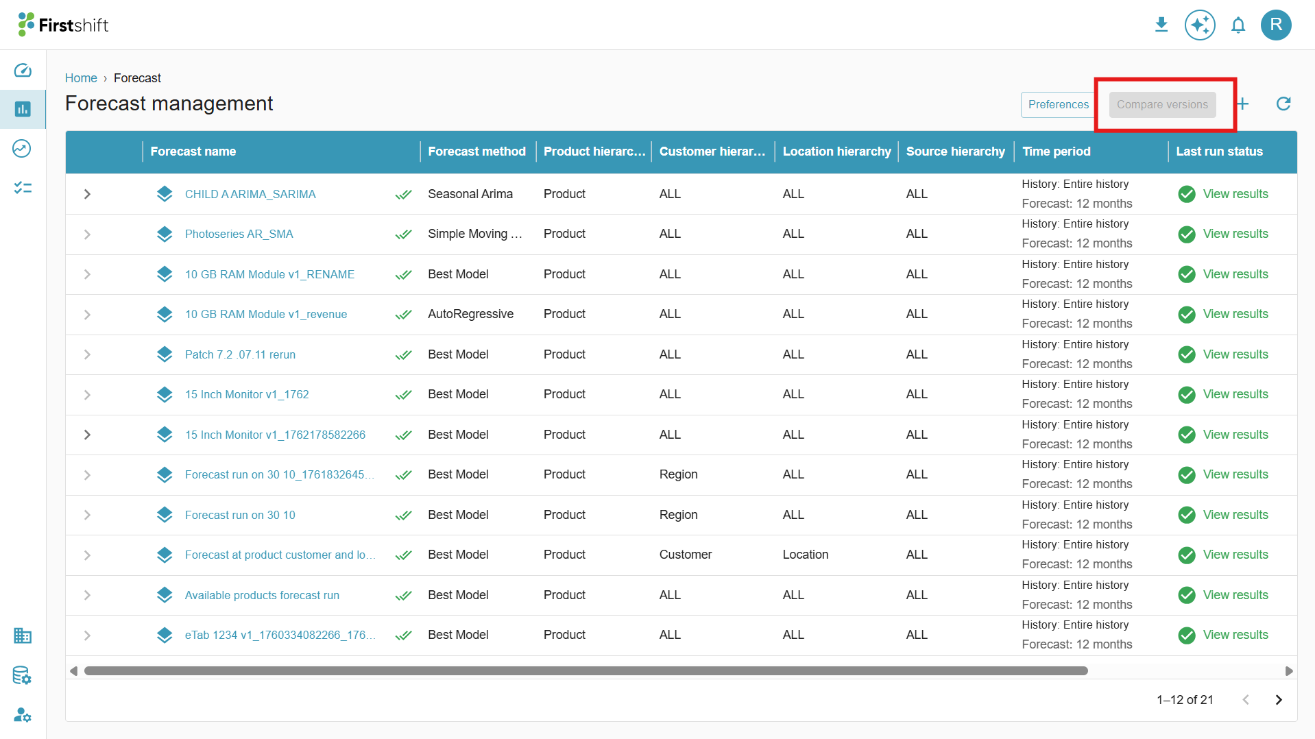
How many forecasts can be selected to compare the results
The compare versions option will be in disabled mode; to enable this, you have to select 2 or 3 forecast scenarios. For each forecast scenario, a check box will be provided. You can compare the forecast by selecting 2 or 3 check boxes of the forecast scenarios.
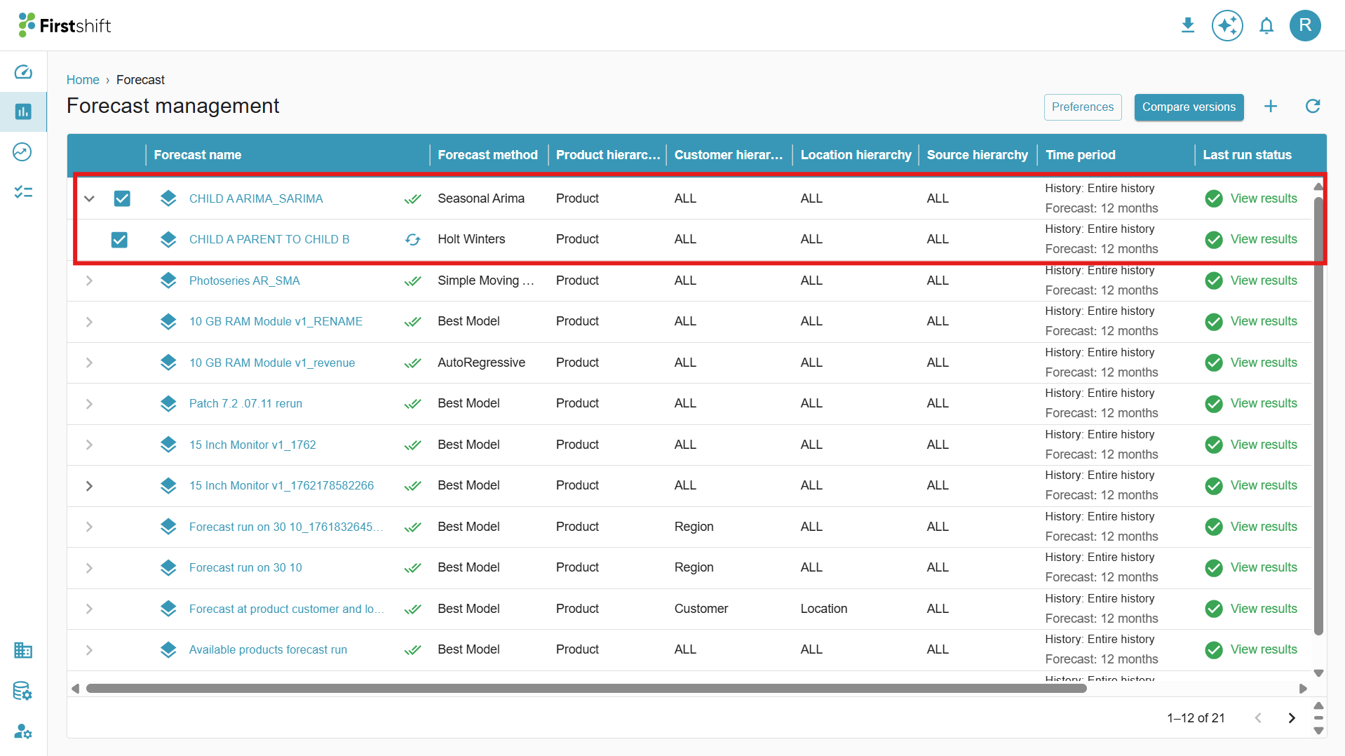
After selecting the forecast scenario checkboxes, the compare versions option will be enabled.
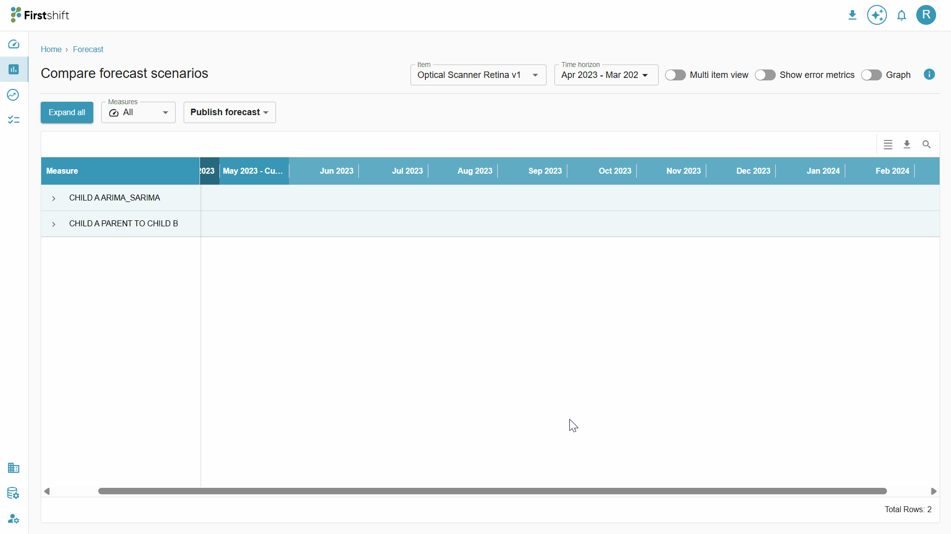
Clicking on that will open the following screen.

Comparing forecast scenarios consists of details of all selected forecasts with a multi-item view and error metrics.
By default, the table will appear in collapsed mode. You can click on one of the forecast names to expand the table with values.
 Check below for the complete navigation flow to the compare forecast screen.
How to study forecast results
Multi-item view
Toggle multi-item view to study the results of selected scenarios in a multi-item view.

After enabling the multi-item view, you will see all the items selected during the forecast creation with the selected forecasts for comparing the results.
In a multi item view, all items will appear in the table along with measures, to expand the table click on expand all.

In the multi-item view, for each item, the forecast scenario name and measures will appear; you can compare those values by changing the table view, as shown below.

For each measure, available items will appear along with the forecast scenarios. You can also filter the measures and set a time range as required.
Enable error metrics

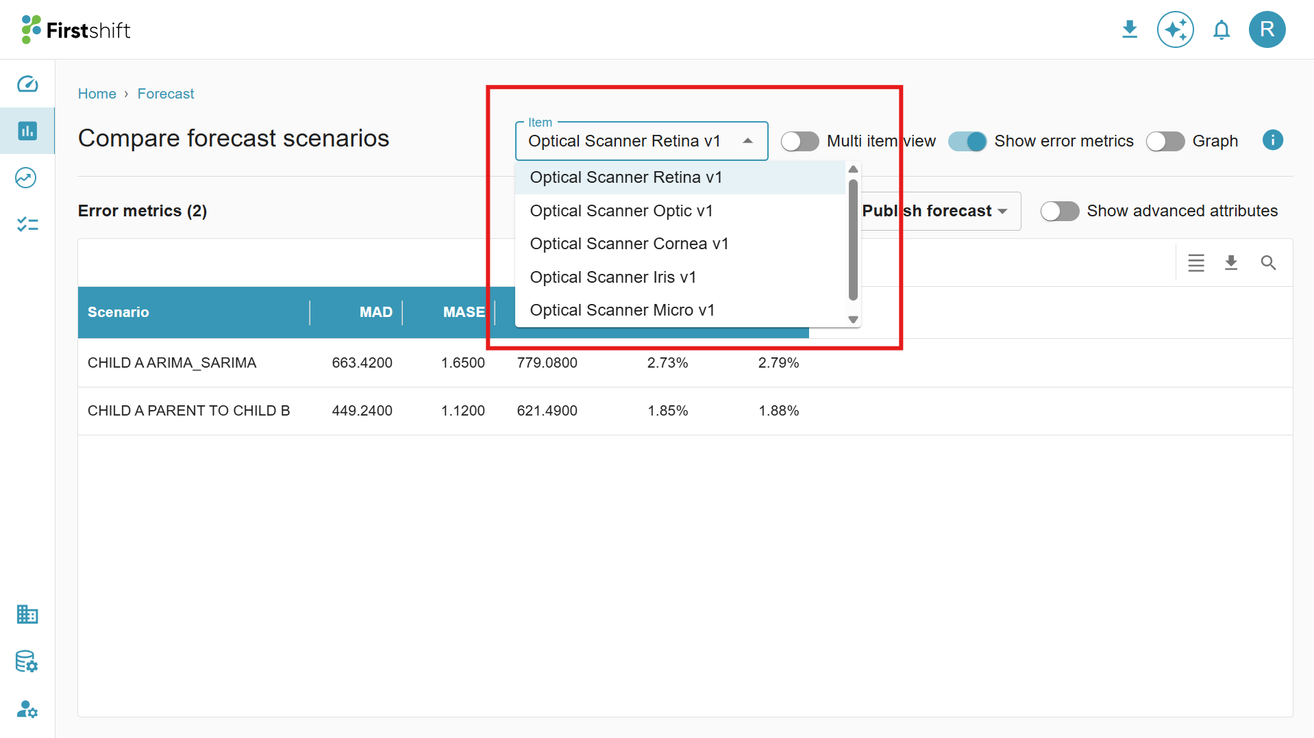
Toggle the show error metrics option to see the values of the error metrics in the form of a table, like below.
When you select only the error metrics option, values will appear for the selected item from the select item dropdown, along with the forecast name. You can choose a different item from the dropdown.
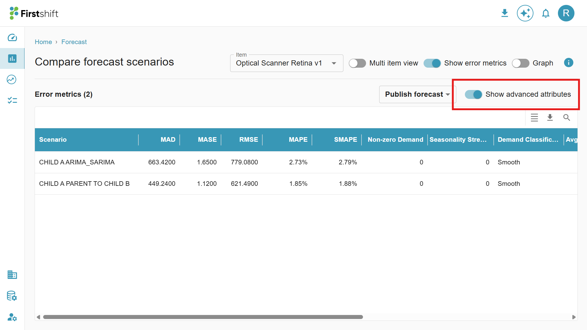
You also have an option to see advanced attributes for the error metrics. Enabling the option will show the additional attributes.
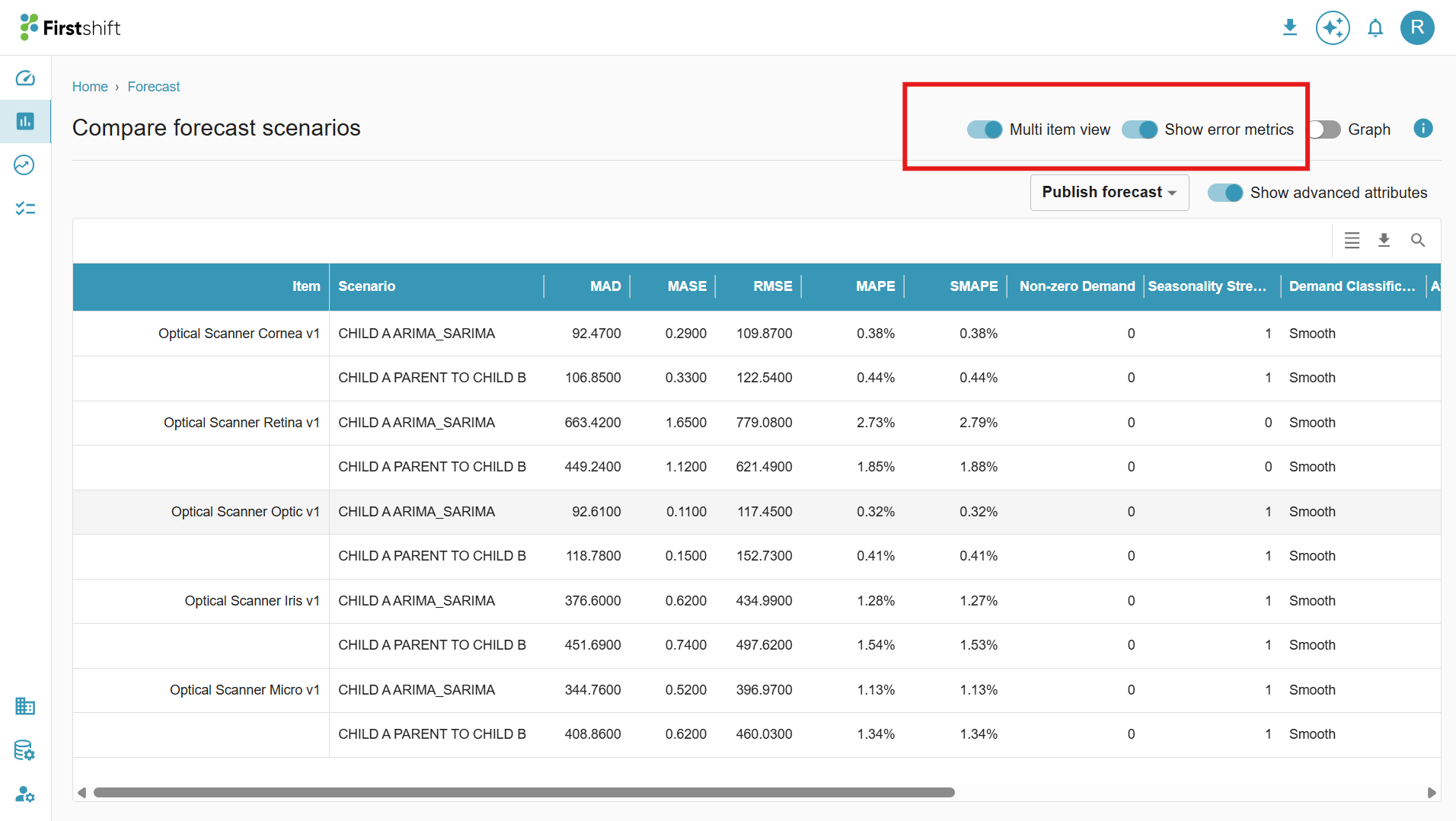
Both multi-item and error metrics options can be selected, where all items will appear in the table with values like below.
Graph
In the Compare Forecast screen, the results are visually represented using an interactive graph for easier analysis and comparison. The graphical view allows planners to quickly evaluate forecast trends, identify deviations, and compare performance.
You can hover over data points to view precise values and use the available filters or options to focus on specific measures, items, or time ranges for a more detailed comparison.

Was this article helpful?
That’s Great!
Thank you for your feedback
Sorry! We couldn't be helpful
Thank you for your feedback
Feedback sent
We appreciate your effort and will try to fix the article