TABLE OF CONTENTS
Overview
This guide explains the functionality of the Multi-Item Planning View. The multi-item view displays all selected planning items in a single, consolidated table, allowing you to easily compare performance, trends, and measure values across multiple products.
By viewing several items side by side, you can quickly identify patterns, differences, and exceptions, enabling more efficient analysis and improved decision-making.
Multi-item planning view
After successfully creating the planning view, you can check the results in the multi-item planning view, the Single-item planning view, and the planning view exceptions.
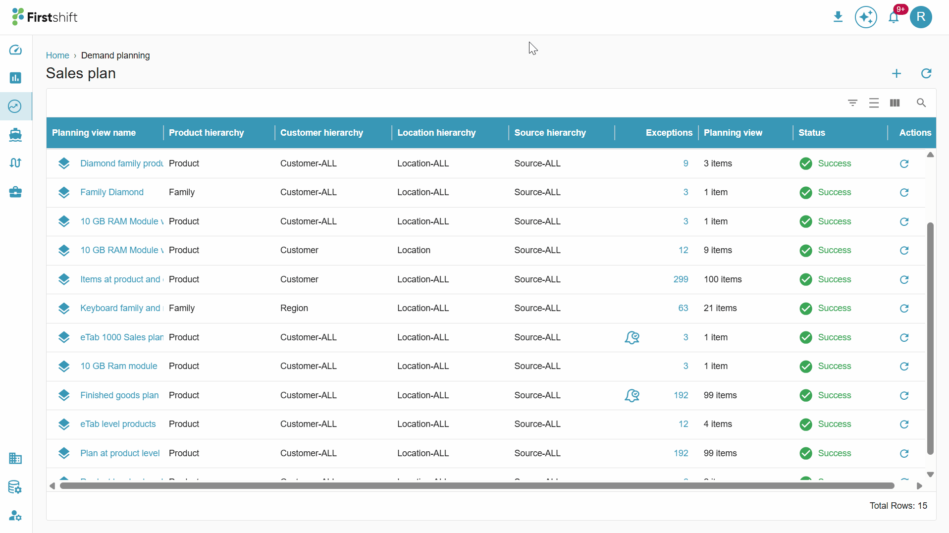
To access the multi-item planning view, click the stack icon. This will navigate you to the multi-item planning view, where all selected items are displayed in a single table.
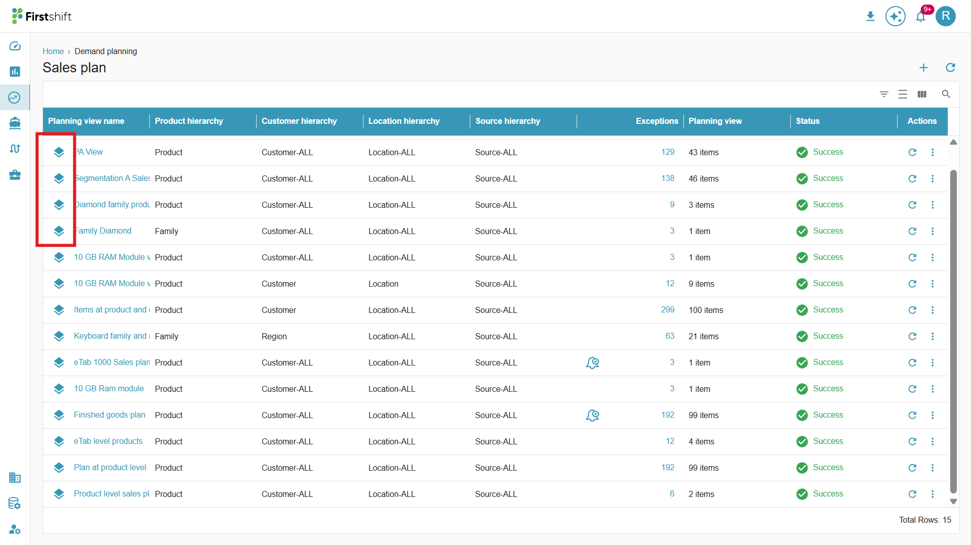
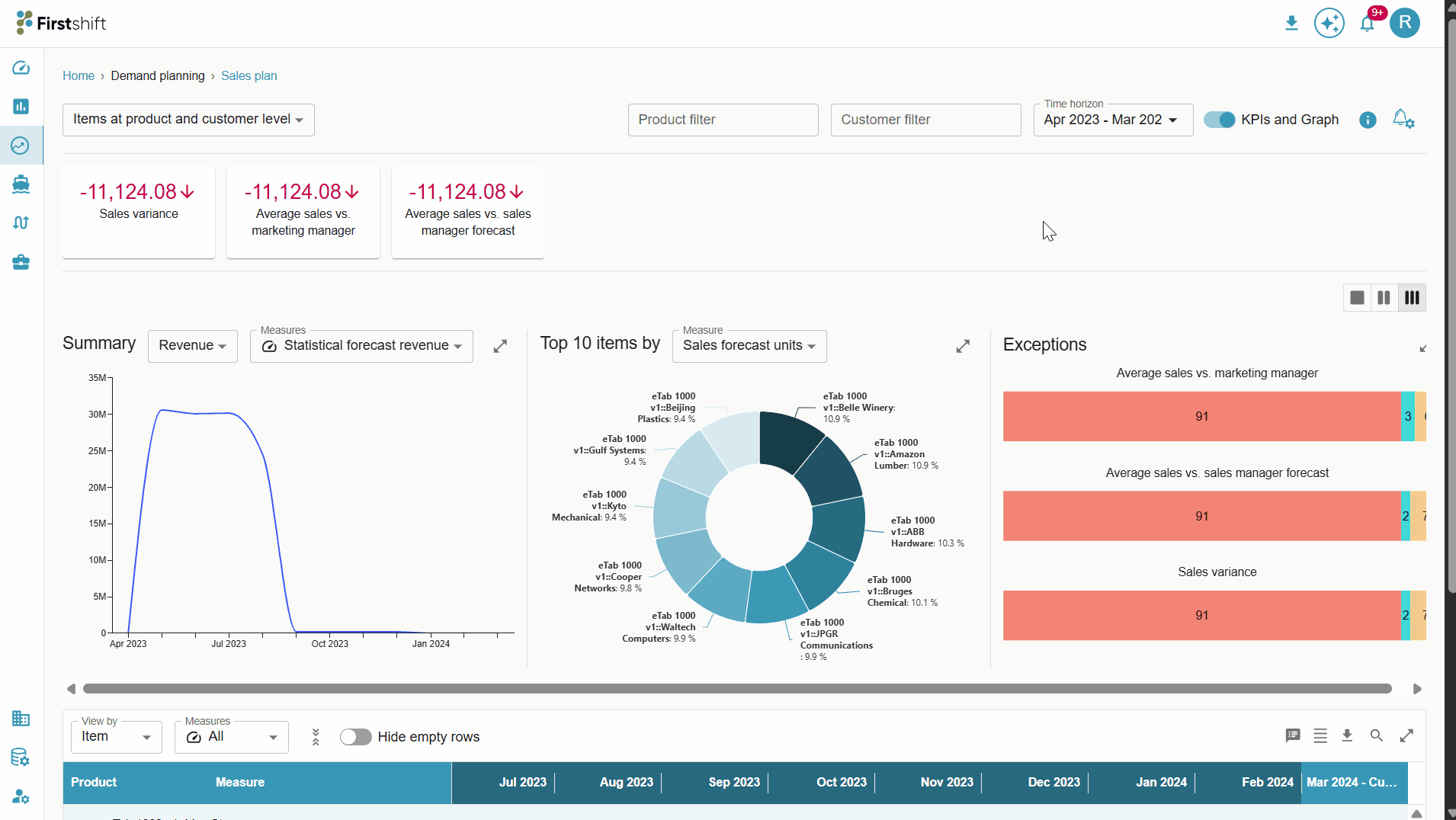
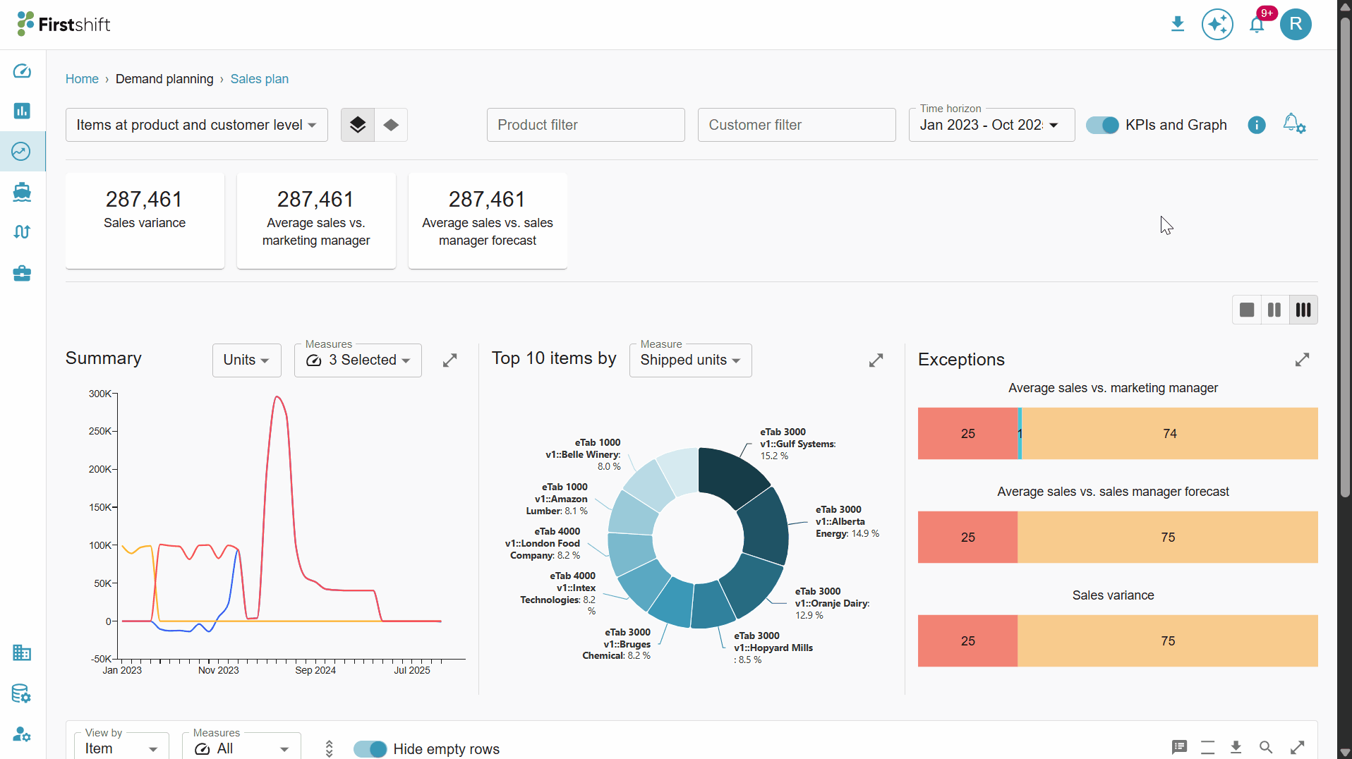
In the multi-item planning view, the page will display the summary graph, Top 10, and exception widgets by default. You can also switch between visualizations and tabular data to better understand trends and exceptions.
Summary graph
The Summary Graph in the multi-item planning view provides a graphical representation of the measures. You can expand the graph to perform a detailed analysis.
By default, the “Unit” measure type is selected.
The graph displays measures based on the selected measure type:
Units: All unit-related measures are shown.
Revenue: All revenue-related measures are shown when selected from the dropdown.
You can change the measure type using the dropdown menu.
Measures can be selected or unselected from the measures dropdown. By default, all measures are chosen.
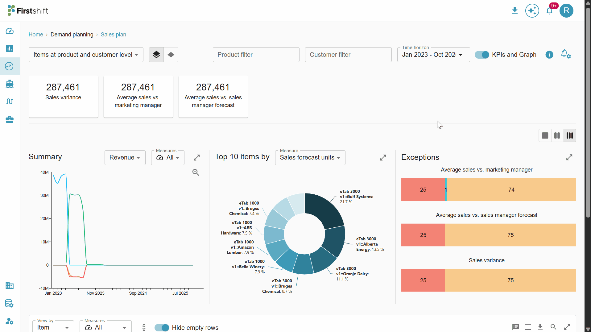
Top 10 items
The Top 10 Items widget provides a graphical representation of the items in your planning view, filtered by a selected measure. You can hover over each segment to view detailed information, including the item name and measure value.
Measure Selection: You can choose which measure they want to focus on. For example, they might select “Unit Sales” to see the top 10 best-selling products or “Revenue” to see the items contributing most to the total revenue. Changing the measure dynamically updates the graph to reflect the top 10 items for that specific metric.
Expandable Table View: The widget can be expanded to show a detailed tabular view of the top 10 items. This table provides a more granular perspective. This is useful when you want to analyze the data in a structured format.
Download Option: You can download the data behind the widget by clicking on the download button. The download is typically available in standard formats such as CSV or Excel, enabling further offline analysis of the values.
Exceptions
The Exceptions widget will help you quickly identify item deviations. It highlights items that deviate from expected or target values. Hover over the widget to see the number of items that fall under different deviations.
Exceptions are not a default widget; they appear in the multi-item planning view only when exceptions are added during planning grid creation in the admin application.
Deviation Categorization: The widget classifies items into three categories based on their deviation:
Positive Deviation (? Yellow): Items performing better than expected or exceeding targets.
Negative Deviation (? Red): Items performing below expectations or falling short of targets.
Neutral Deviation (? Green): Items that are within acceptable ranges and do not require immediate attention.
Expand the exception widget to access the values in a tabular format. The values in the table are identified by color.
Red: Values in red represent items that fall within the negative deviation range.
Orange: Values in orange indicate items within the neutral deviation range.
Green: Values in green signify items in the positive deviation range.
Click on the download button to download the exception widget table.
Widget layout
The layout of the multi-item planning view widgets can be changed. By clicking on the layout option, as shown below.
One chart at a time: Selecting this option shows a single widget, and you must scroll right to see the other widgets.
Two charts at once: Selecting this option will show two widgets; scroll right to see the third widget.
Three charts at once: All three widgets will be displayed on the screen.
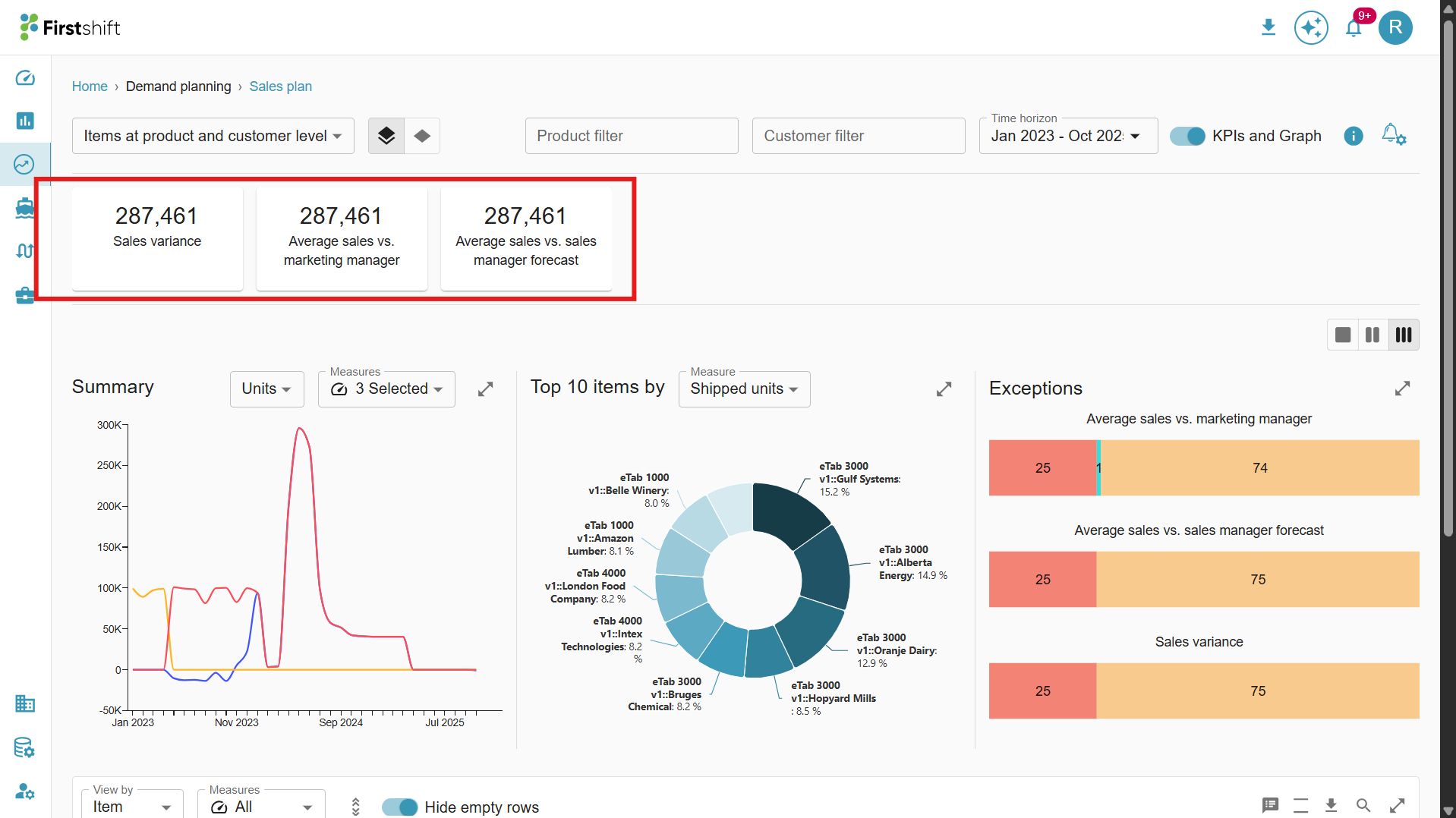
KPIs
The exceptions added to the planning grid will be displayed here. This shows the overall values generated for all selected items during planning view creation.
Example:
Sales variance: Highlights items where sales have significantly deviated from expected norms.
Average sales vs. marketing manager: Compares actual sales to the marketing manager's forecast.
Average sales vs. sales manager forecast: Compares actual sales against the sales manager’s forecast.
Each planning grid can have multiple exceptions. The implementer can configure the exceptions in the admin app for the planning grid.
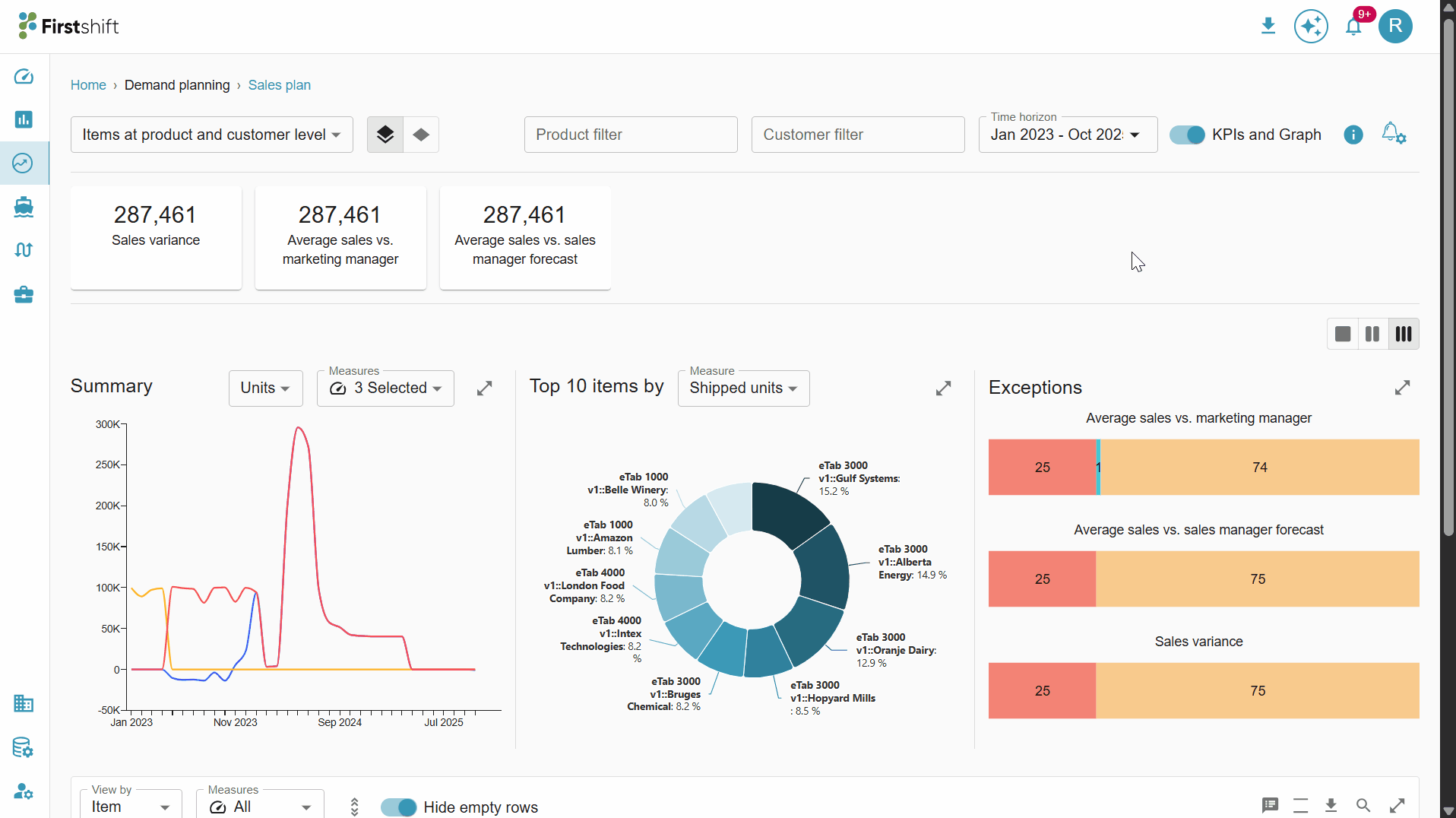
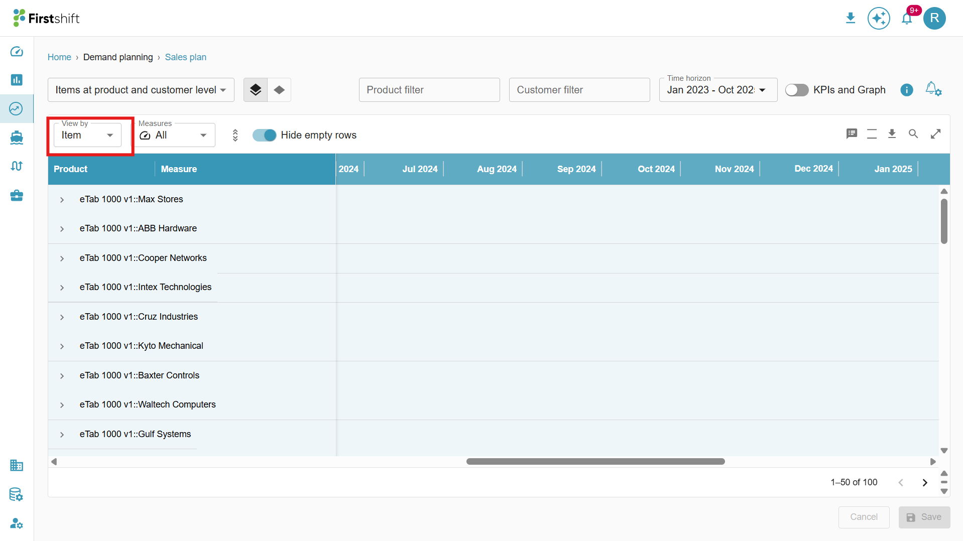
KPIs and Graph toggle: This toggle lets you disable KPIs and the graph in the multi-item view. Once disabled, only the table will be shown in the multi-item planning view.
Check the illustration below to disable and enable the KPIs and Graph.
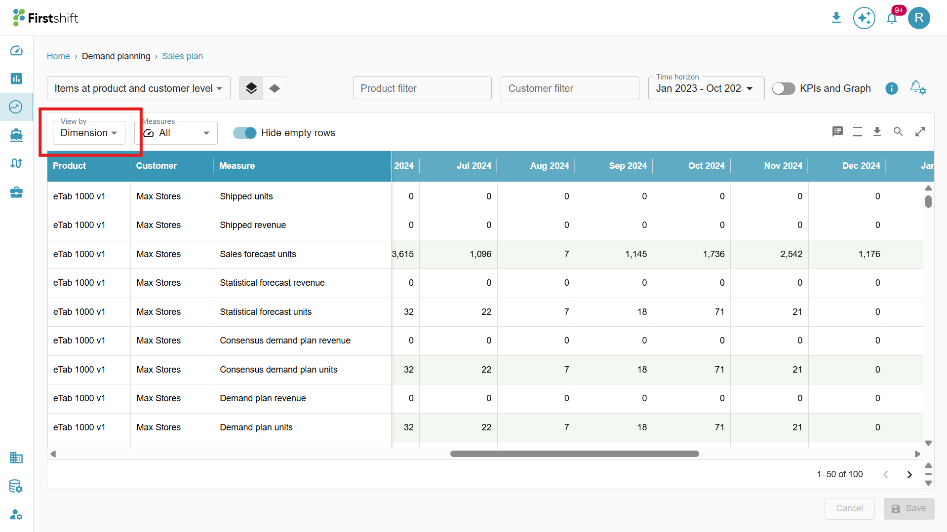
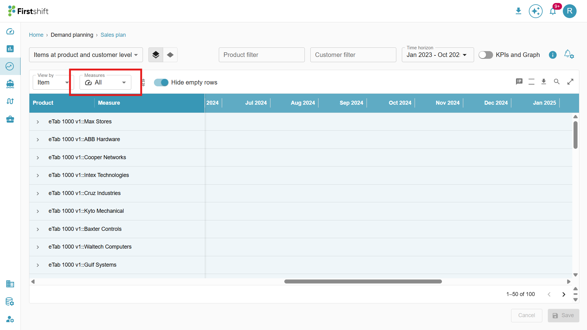
View by:
You have the flexibility to analyze the tabular results in multiple ways based on their review needs:
Item view: The Item View is the default display mode for the table. In this view, all selected item combinations appear as column headers, and their corresponding measure values are listed beneath each header.
Measure View: When the Measure View is selected, the table displays measures as column headers, with the corresponding item-level values listed beneath each header. This layout allows you to compare how different items are performing across multiple measures in a single view.
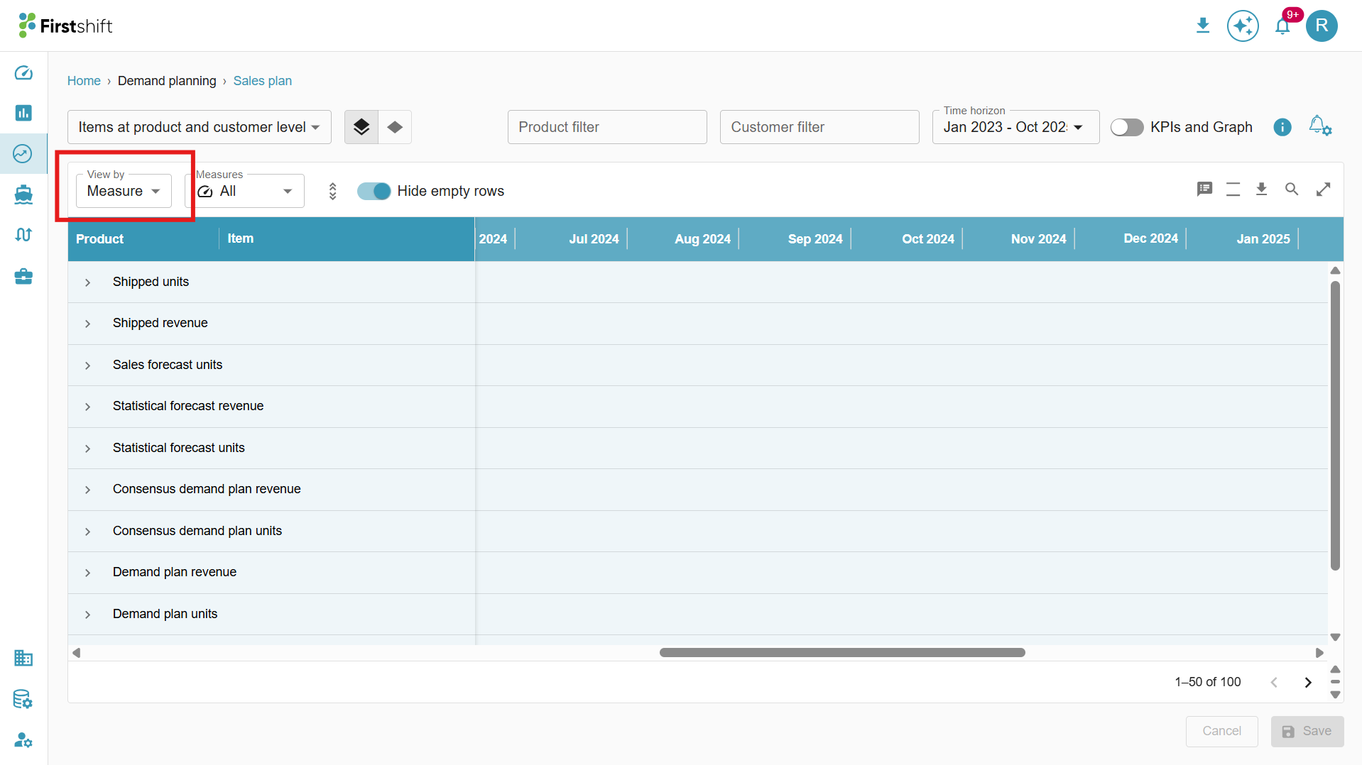
Dimension View: When the Dimension View is selected, the table displays all selected measures along with the corresponding item values.
Measures:
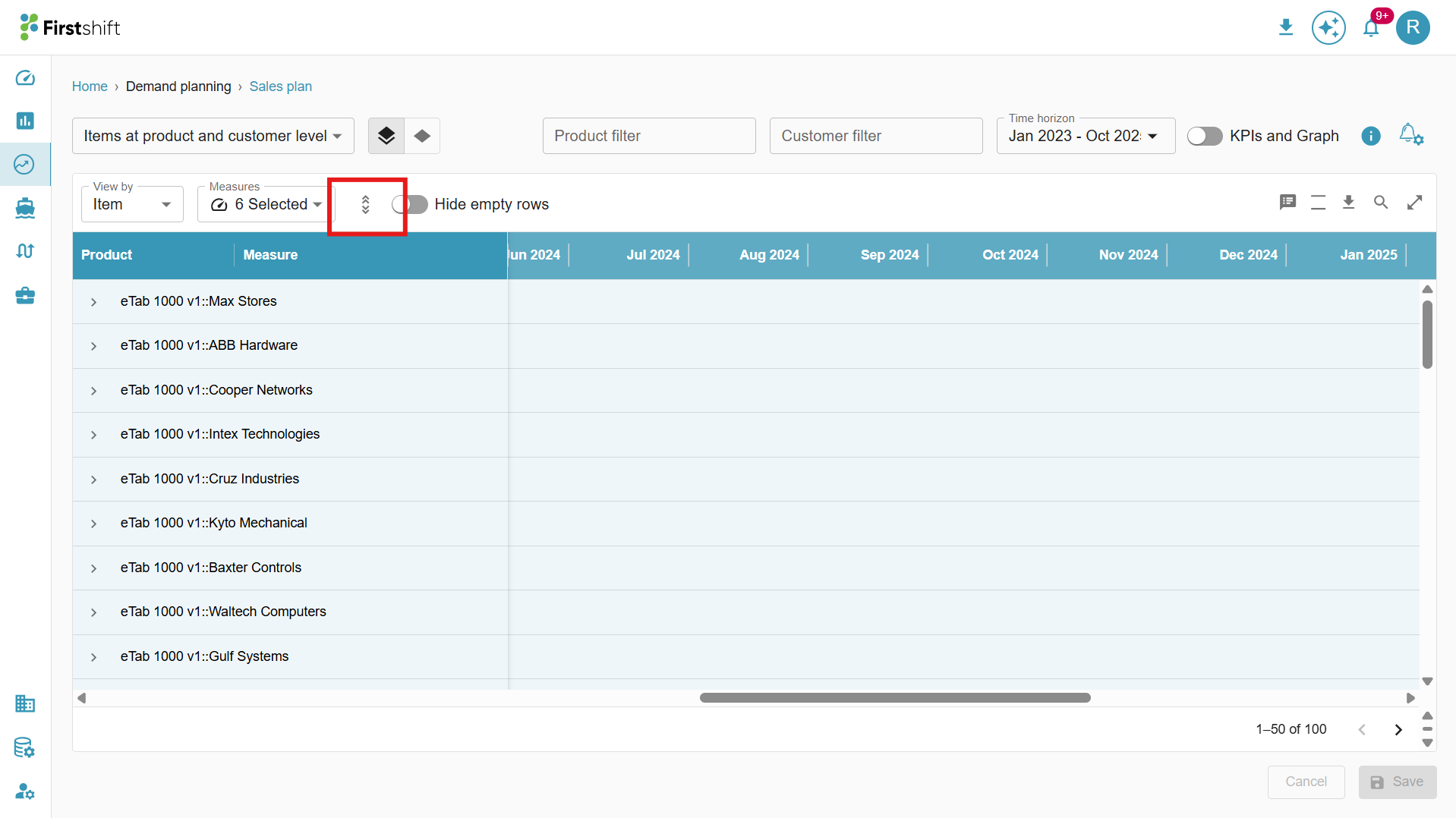
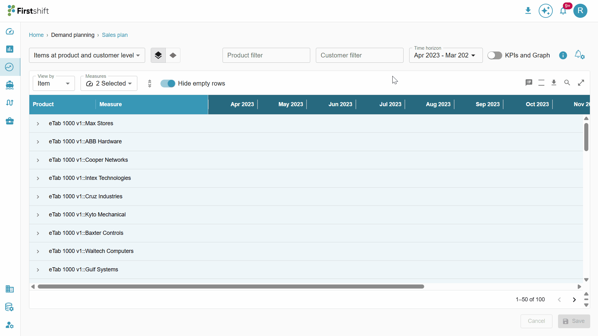
All measures selected during planning grid creation are listed in the Measures dropdown. You can choose one or more measures from this list to filter tabular results, showing only the measures relevant to their analysis.
Clicking the measures dropdown displays a list of all configured measures, allowing you to select and filter the measures you want to view in the table.
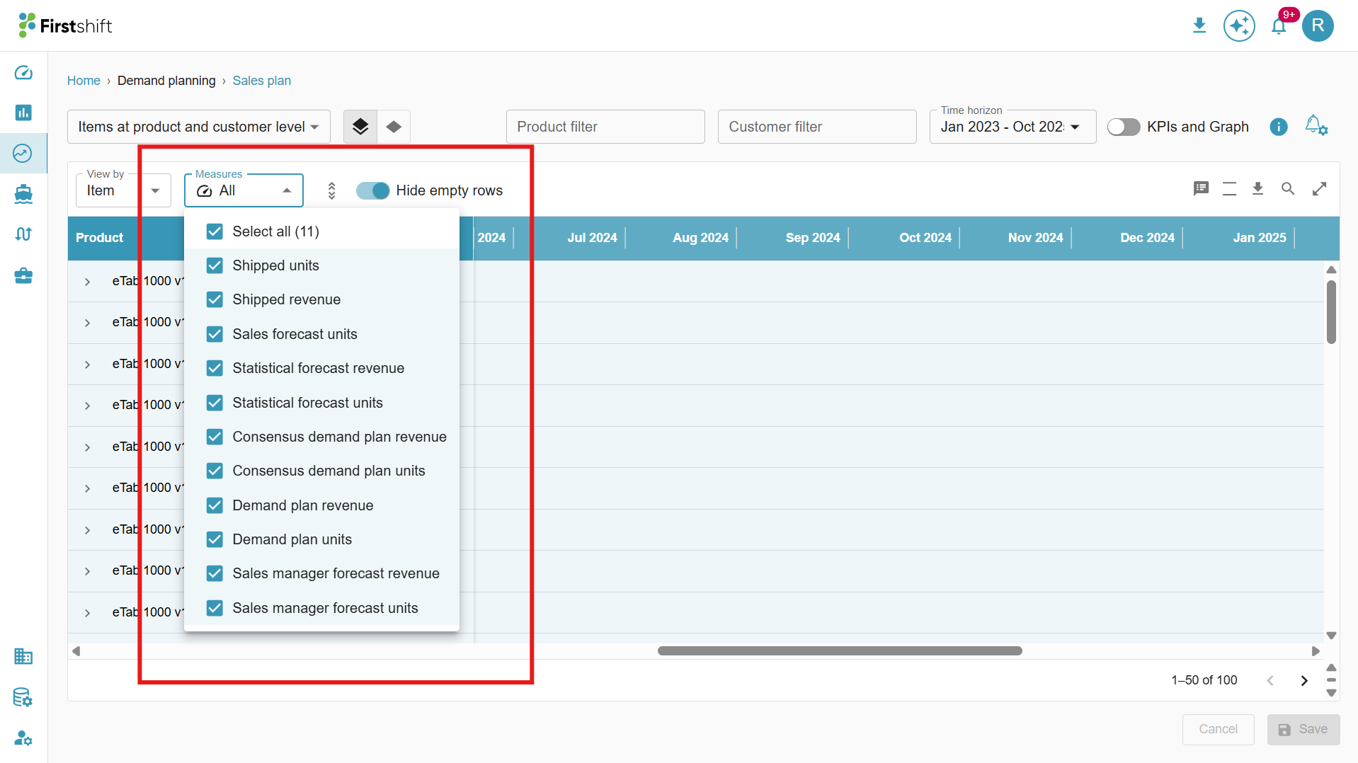
The measures selected from the dropdown will be displayed in the table along with their corresponding values.
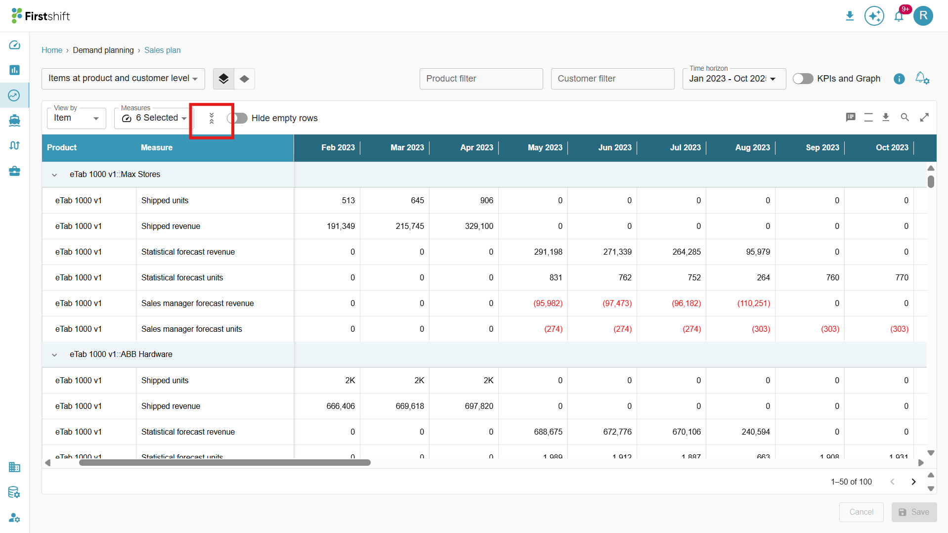
Expand all, collapse all.
Expand All:
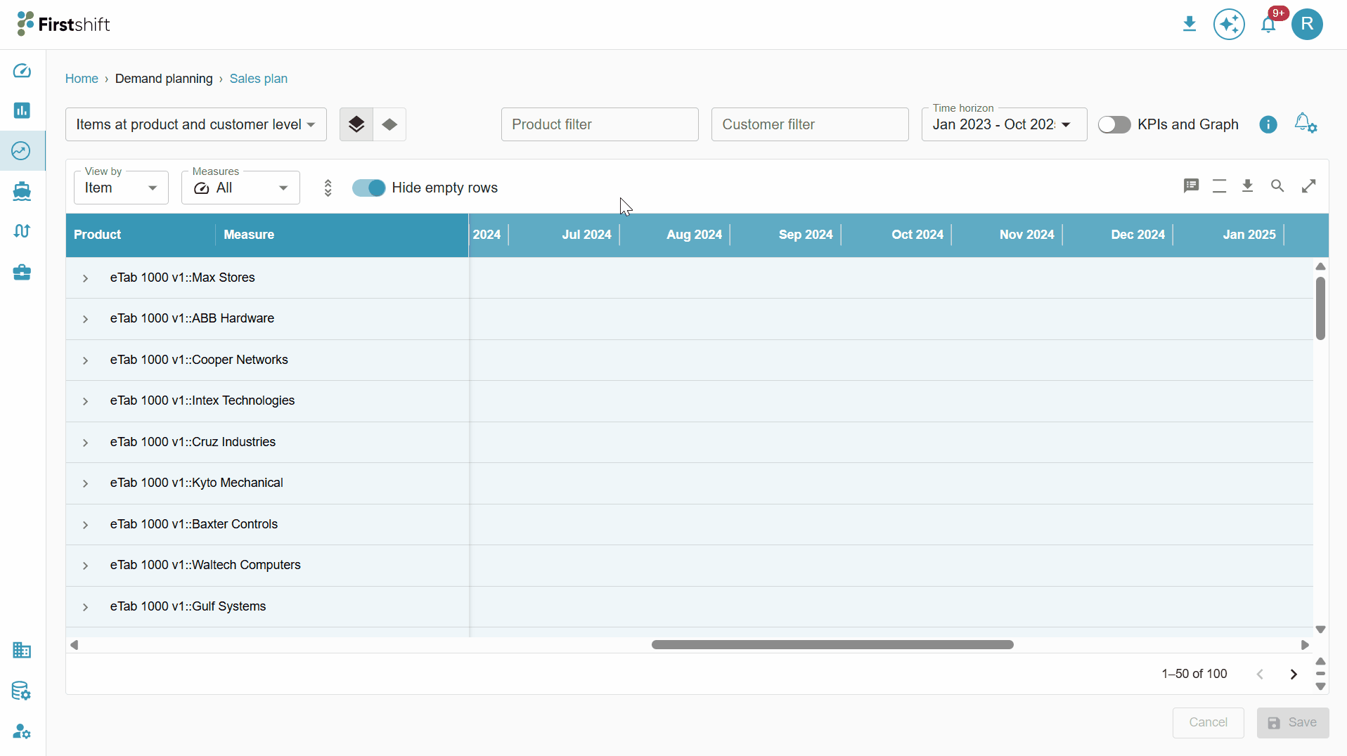
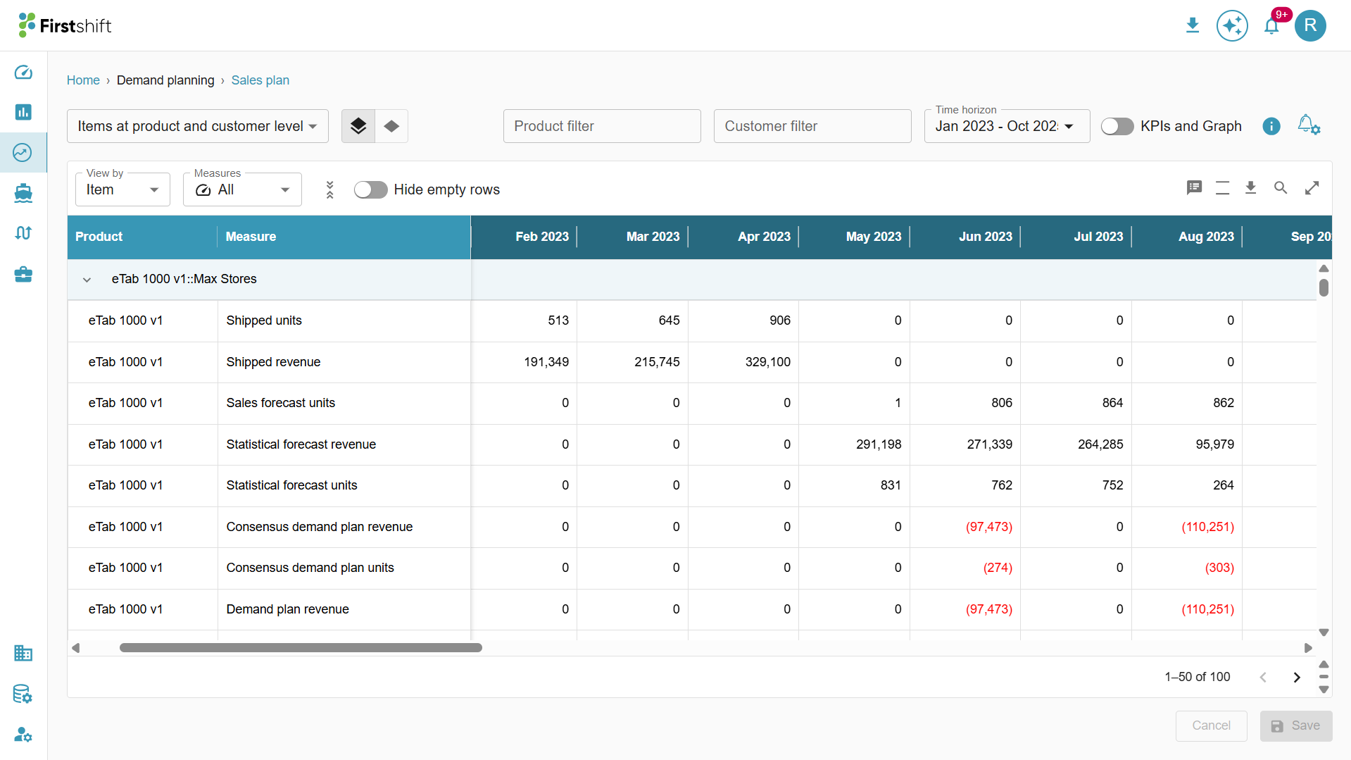
By default, the table in the Multi-Item Planning View is collapsed, showing only the top-level data.
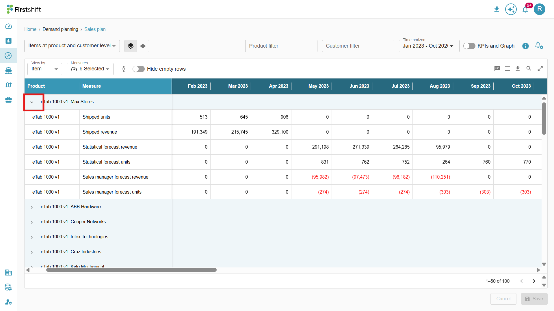
To view the details of the selected items, click the Expand All option.
This will expand the table to display results based on the hierarchy level selected during planning view creation.
The expanded view of the table is shown below.
You can also expand a single row by clicking on the arrow button provided next to each header. This allows you to view the detailed breakdown of that specific hierarchy level without expanding the entire table.
Collapse All
After clicking Expand All, the Collapse All button will be enabled.
Click on Collapse All to revert the table to its original format, hiding the expanded hierarchy levels.
This helps maintain a cleaner and more structured view by displaying only the top-level data.
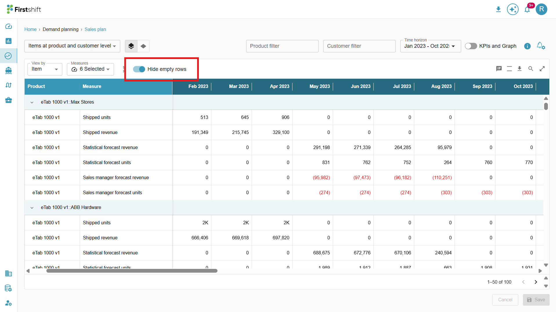
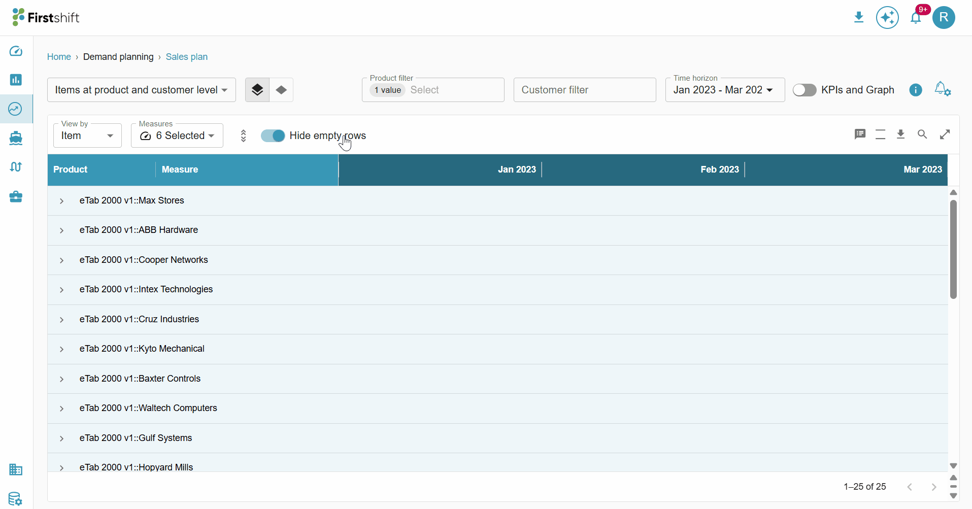
Hide Empty Rows
Enable: If you want to remove rows where all measure values are zero, enable the Hide Empty Rows toggle. This will remove measures with zero values, keeping the table concise and focused on relevant data.
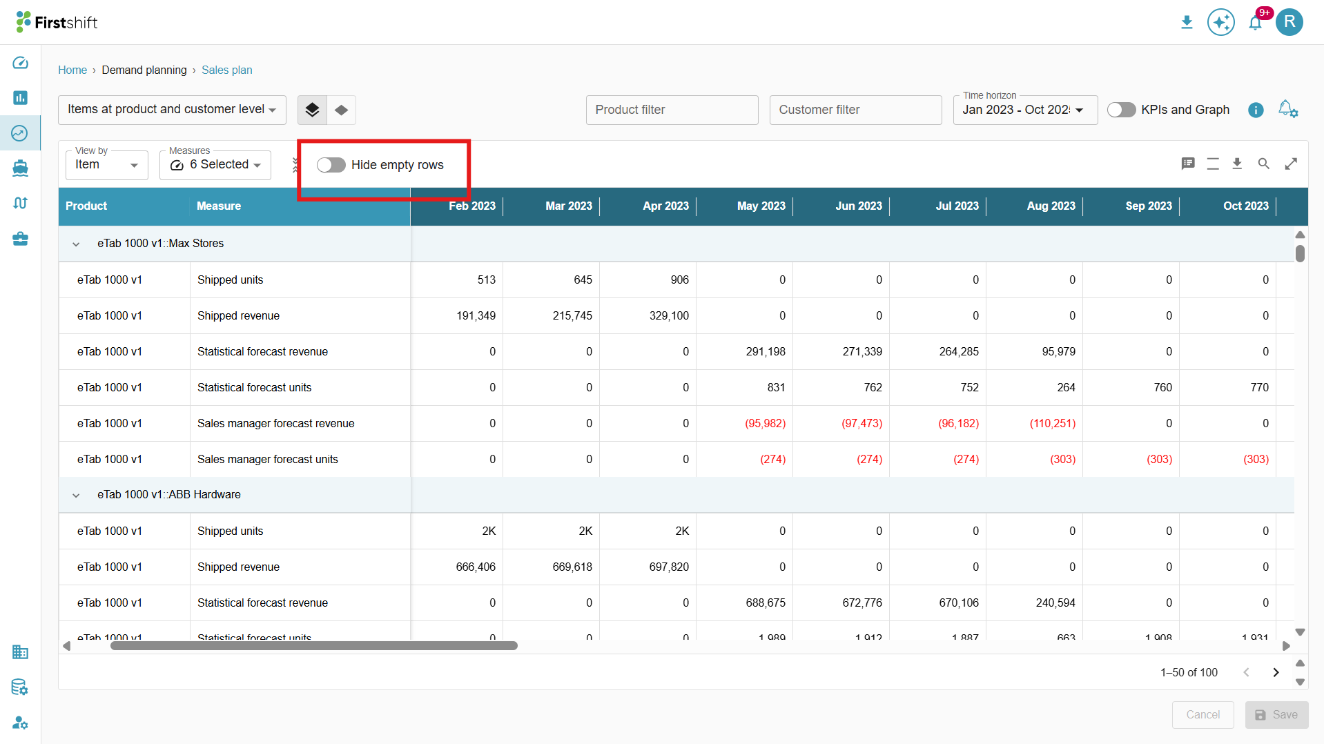
Disable: If the measures of the selected items have zero values across the entire time range, they will be hidden when the “Hide empty rows” toggle is enabled. Disabling the toggle displays all measures in the table, including those with zero values.
Hierarchy dropdowns
The Hierarchy Level Dropdowns in the image below allow you to filter and analyze data by selecting the items from the attribute dropdowns. These dropdowns help refine the planning view by allowing the selection of specific items.
When items are selected in the dropdown, the table updates accordingly to display relevant data.
These dropdown filters are displayed based on the hierarchy level selected during planning view creation.
For example, if the planning view is configured with the hierarchy levels Family → Region → Location → Source – All, then the Family, Region, and Location dropdowns will be visible in the Multi-Item Planning View.
You can apply these filters to narrow the displayed items and analyze data at the desired hierarchy level, enabling a more focused, efficient review.
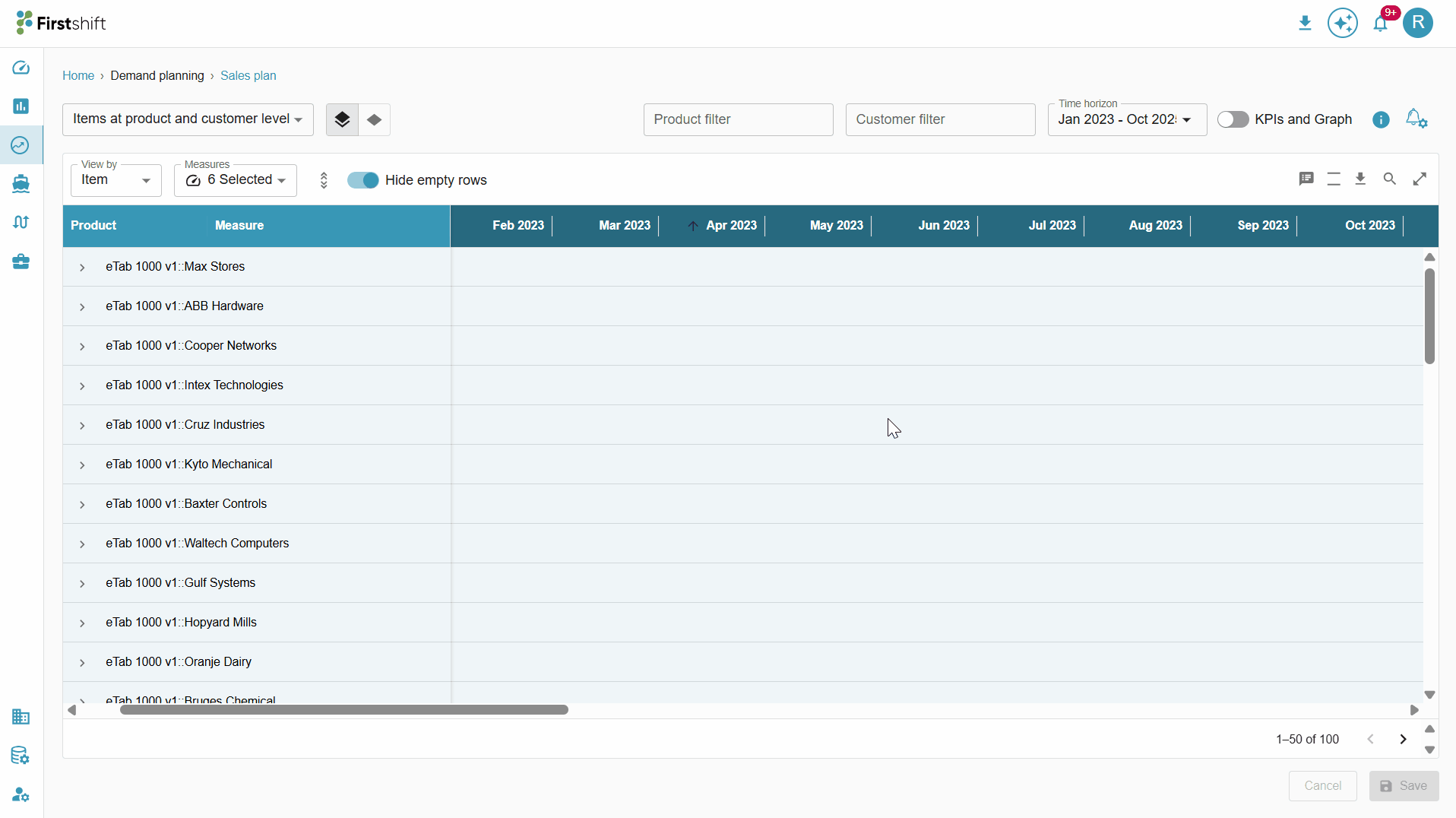
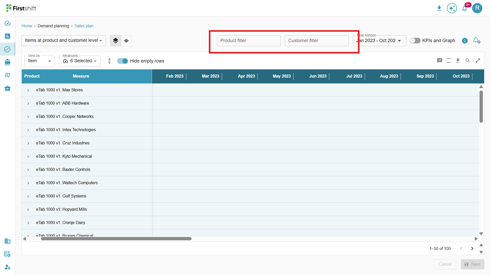
Time horizon:
The time horizon defines the period for which the data is displayed in the planning view table. You can select a custom time range to view historical, current, or future data based on your analysis needs. The selected time horizon determines which columns are shown in the table.
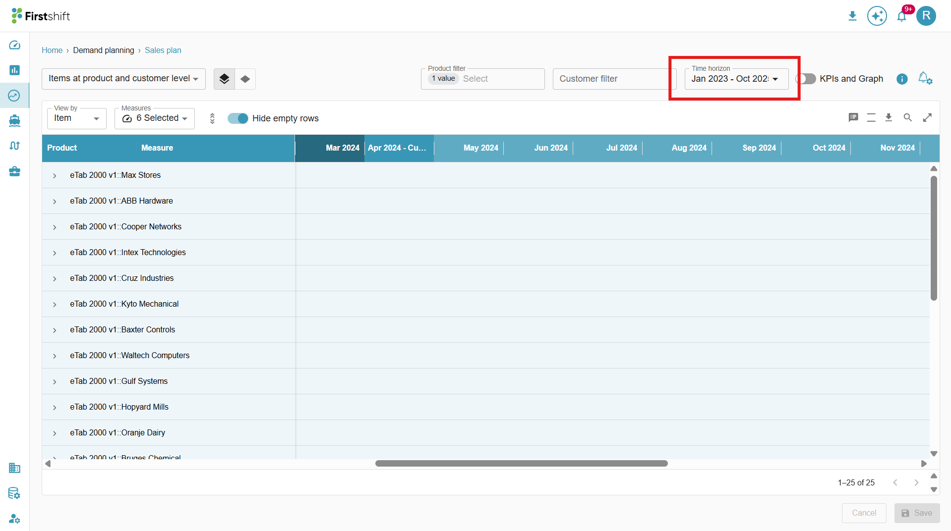
Clicking the time horizon opens a dropdown that lets you select the time period you want to view in the table.
Planning view information:
To check the information about the planning view. Click the “planning view information” button. This panel stores essential information about the created planning view, including selected hierarchy levels, applied filters, etc.
The Info Panel is available in the Multi-Item View, Single-Item View, and Exceptions screens. To access the panel, click the Info button on any results screens.
Toggle to switch between Multi-item and Single-item view
A toggle has been introduced to allow planners to seamlessly switch between Multi-Item and Single-Item planning views.
In the Multi-Item Planning View, a toggle is available to quickly navigate to the Single-Item Planning View for more focused analysis.
Once you switch to the single item view, the screen exactly reflects the single item view, where only the summary graph is disabled, and the table will show only details related to the single item, and you can select a different item from the "select item" dropdown.
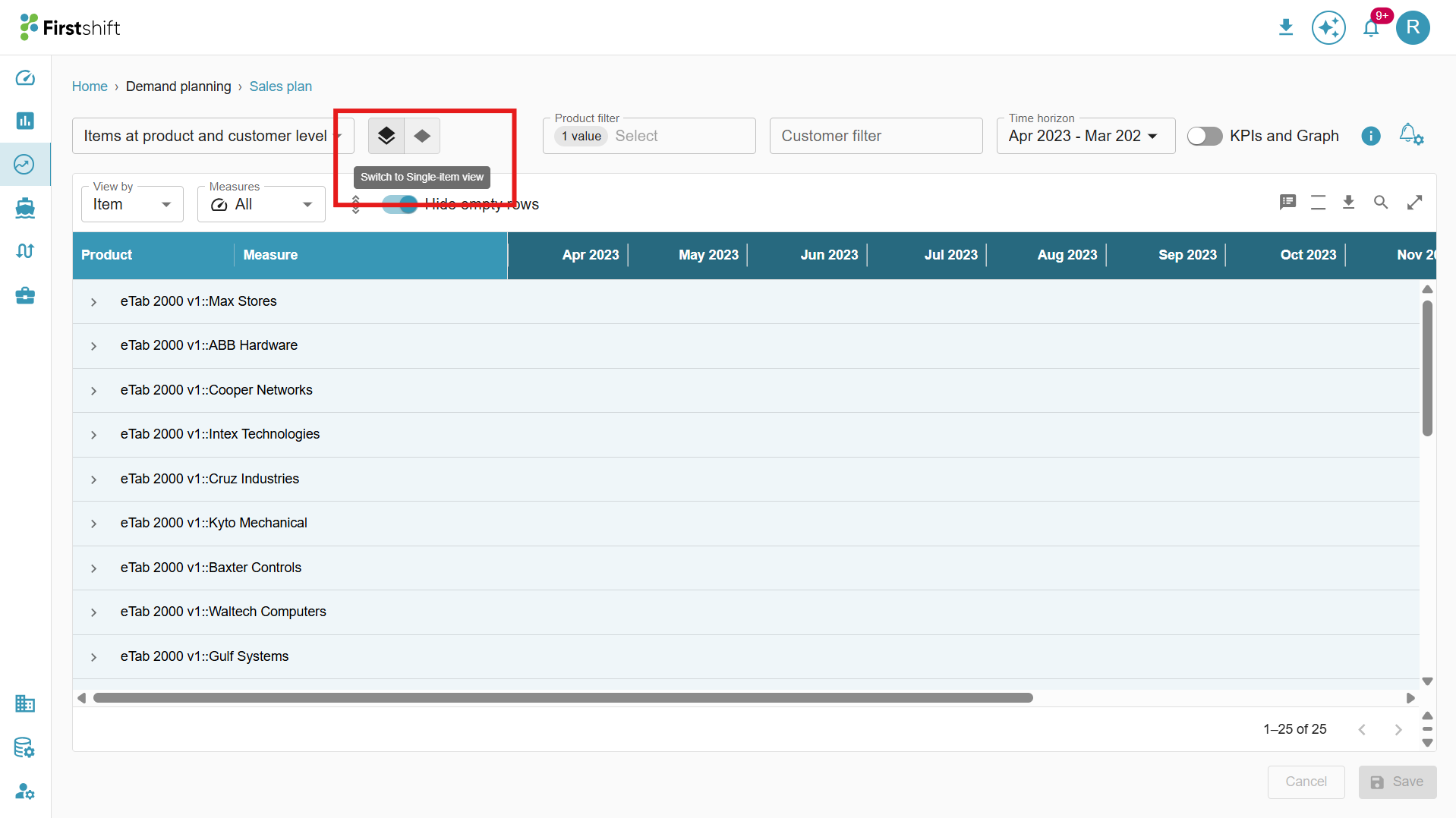
Similarly, in the Single-Item Planning View, a corresponding toggle is provided to switch back to the Multi-Item Planning View whenever needed.
You can dynamically switch between the two views without reselecting the planning view filters.
When switching between views, the application automatically retains the selected planning view and filter criteria, including:
Active filters
Applied search terms
Download
The values in the multi-item planning view can be downloaded. The downloaded files will display values based on the user's selected preferences.
Example: If you select only shipped units and shipped revenue from the measures dropdown and a custom time range from Apr 23 to Jun 23, the downloaded file will show the shipped units' measures and data for that time range. Similarly, the downloaded sheet will show results based on the user preferences, such as expand all or collapse all, selected hierarchy level, selected view by, etc.
The Download option provides two choices:
Desktop Download (Max 50 items): This option allows you to download data for up to 50 items displayed in the planning view.
Download Full Dataset: This option lets you download the data directly from the server side, ensuring that all relevant filters and view types (such as item, measure, and dimension) are included in the output. This enables a comprehensive download of the entire dataset with the applied configurations.
When this option is selected, the download process initiates a server-side download of all relevant data from the database, rather than from the UI or a direct SQL query.
This download will support all the filters applied in the planning view, such as Dimension Filters (e.g., Product, Customer, Location, Source), Measure Filters, and Time Range Filters.
The full dataset download details will be stored in the download folder within the user interface.
Click on the Refresh button to update and view the latest status of the dataset download.
Status:
Active: The download was successful and is ready for use.
Processing: The download is still in progress and has not yet been completed.
Failed: The download was unsuccessful due to an error.
Was this article helpful?
That’s Great!
Thank you for your feedback
Sorry! We couldn't be helpful
Thank you for your feedback
Feedback sent
We appreciate your effort and will try to fix the article