Overview
This article helps you understand the Planner Workbench's capabilities, including the roles and permissions required to access and manage it, how to create bookmarks in the Workbench, and the key features for analyzing, editing, and controlling planning data effectively.
Purpose of the planner workbench
The Planner Workbench is a centralized workspace that enables you to analyze detailed planning data, perform overrides and adjustments, and make informed decisions based on both system-generated outputs and business inputs. It enables viewing data at granular levels, applying filters and bookmarks for focused analysis, and interacting with key measures such as demand, forecast, inventory, and supply.
It also supports advanced features such as drill-downs, audit trails, comments, and lock edits/lock disaggregation, allowing you to track data changes, collaborate effectively, and maintain control over the planning process. Additionally, the Planner Workbench seamlessly handles features such as unit of measure (UOM) and multi-currency, ensuring that all values are accurately displayed and calculated based on user selections while maintaining base-level consistency across the system.
Menu
Planner Workbench can be accessed from the Left Menu by clicking “Planner Workbench.”
Feature toggle: The planner workbench is feature-toggle-driven. This appears only if the planning workbench feature is enabled at the Tenant level.
If the feature toggle is disabled, the planner workbench will not appear in the business application.
Note: Planner Workbench is an out-of-the-box capability enabled for every tenant. However, if you don't see this option, it might be for two reasons. Either you don't have access to it, or it is not enabled for the Tenant.
Roles and permissions
Access to the Planner Workbench is controlled through the Roles and Permissions. Based on the permissions assigned to your role, you can create, edit, view, or delete Bookmarks in the planner workbench. These permissions are configured and managed by an administrator in the Roles and Permissions.
Working with Planner Workbench
Create a bookmark for the first time
To create a bookmark, click the Planner workbench icon from the left navigation menu. Clicking the icon opens a page where you must select a filter or hierarchy level.
Select filter (optional): Selecting a filter is optional. You can select an existing data filter or create a new one, then click Apply to add it to the bookmark.
Select hierarchy: Selecting a hierarchy level is mandatory to create a bookmark. The planner view is created based on the selected hierarchy, and you can select the hierarchy directly without applying any filters.
Table: After selecting a hierarchy level, the application displays a table of all available items at that level. The table also indicates the total number of items available at that hierarchy level.
For example, if the selected hierarchy level is Family: All: All: All, all planning items under this hierarchy level are automatically selected for the planner view.
Add drilldown levels: The Add drilldown levels option lets you choose one or more drilldown hierarchies as part of the bookmark itself, rather than selecting a drilldown hierarchy later inside the Details table. The drilldown hierarchies you add here are saved with the bookmark and become available in the disaggregation views.
Note:
Adding drilldown levels is optional. You can create a bookmark with just a filter and a parent hierarchy, then click Apply — no drilldown level is required. You can always add drilldown levels later from the planning view, or by editing the bookmark.
Why is it disabled first? Drilldown levels are always defined relative to the selected parent hierarchy. Until a parent hierarchy is chosen, the application cannot determine which levels are valid for drilldown, so the button stays disabled.

When previous selections exist
Based on the selected parent hierarchy, the application suggests the previously used drilldown hierarchies, if any exist. These appear under a Previously used heading as selectable checkboxes, so you can quickly reuse a drilldown combination without rebuilding it.
The suggestions are specific to the parent hierarchy you selected — different parent hierarchies surface different "Previously used" lists.
Select one or more of the suggested combinations using their checkboxes.
For example, when the parent hierarchy is Product | Customer-ALL | Location-ALL | Source-ALL, the previously used section may suggest:
Product | Customer | Location | All
Product | Customer | All | All
Product | All | Location | All
Note: The previously used hierarchies were created by other users within the Tenant when creating bookmarks at either the parent or drill-down level.
Below the suggestions, the Select hierarchy levels dimension dropdowns are also available, so you can build an additional drilldown hierarchy that is not in the list.

When there are no previous selections
If no drilldown hierarchies have been used for the selected parent hierarchy before, the Previously used section is not shown. Only the Select hierarchy levels dimension dropdowns appear. Using these dropdowns, you can build a drilldown hierarchy for the parent hierarchy from scratch.

Building a drilldown hierarchy from the dimension dropdowns
The Select hierarchy levels area provides one dropdown for each dimension— Product, Customer, Location, and Source. Choose a level in each dimension as required to define the drilldown hierarchy, then click Add. The Add button remains disabled until a valid selection is made.
- Level restrictions (relative to the parent hierarchy)
- Drilldown level selection follows the same rules as the drilldown hierarchy in the Details table:
- Levels above the parent hierarchy are disabled. You cannot select the same level as, or any level higher than, the parent hierarchy chosen for the bookmark. Higher-level hierarchies are shown in a disabled state and cannot be selected.
- Only levels below the parent hierarchy can be selected. This ensures every drilldown hierarchy represents a valid lower-level disaggregation of the selected planning level.
Apply: Once the hierarchy selection is complete, click Apply. The Planner Workbench view is generated immediately based on your selections.

After creating a bookmark, the application loads the Planning View in single-item view by default. The application displays Planning Items based on the selected parent hierarchy with an option to expand each Planning item. Based on the selected item, the application displays the next drilldown hierarchy for the details table in the single-item view. You can then switch to a different planning item using the Planning Item dropdown if needed, or change to a multi-item view.
Select measures and time range
Select measures
The application displays a message in the planner view stating “Select the measures to see data.” Measures must be selected to view data in the planner view. To begin selecting measures, click the Measures button. This opens a pop-up window that displays all available measures configured in the admin application. The measures are organized into categories such as Transactions, Loaded Measures, and Planning Time Series, making it easier to locate the required measures. The measures pop-up can be expanded to view of the measures' details.
Available measures: To select a measure, click the icon next to the measure in the Available Measures list. You can select any number of measures by clicking the icon for each required measure. Once selected, the measure moves to the Selected Measures table and is no longer visible in the Available Measures list. This panel can be collapsed or expanded when needed.
Selected measures: All selected measures are displayed in the Selected Measures table, where you can continue refining your selection. You can add or remove measures at any time based on your analysis requirements.
Edit Icon for Editable Measures: When browsing or reviewing measures, a ✏️ pencil icon appears next to the name of any measure that is editable. This indicator is visible in two places:
In the Available measures panel (left), next to each measure in the list
In the Selected measures table (center), in the Measure name column
This icon indicates that the measure is configured as editable. When the editable measure is selected, you can perform overrides for the results.
Measures without the pencil icon are read-only — they are calculated by the system and cannot be manually overridden.
Drag and Drop to Reorder Selected Measures: You can rearrange measures by dragging them to any position in the list. This is particularly useful when you have a large number of selected measures and want to group related measures for easier comparison in the grid.
Update order: To change the display order of the measures, use the up and down arrow icons available in the Selected Measures table. The order you set here determines how the measures appear in both the graph and table within the planner view.
Actions
Measure format settings
The Planner Workbench provides flexible measure-level formatting controls to customize how values are displayed in the table. To add format settings for the measure, click the measures dropdown. A pop-up opens with all the measures available for the tenant. Choose a measure for which you want to adjust the display format. Click the gear icon under the actions. A side panel appears on the measures pop-up to display the format settings of the measure, which include Number format display, Decimal precision, Negative number format, Measure background color, and the Apply to all measures option.Number Display Format: You can enable one or more of the following options:
Use Thousand Separators: Displays values in a readable format (e.g., 1,234,567)
Round off to K (Thousands): Converts values to thousands (e.g., 12,500 → 12.5K)
Round off to M (Millions): Converts values to millions (e.g., 2,500,000 → 2.5M)
Display Negative Numbers in Red: Highlights negative values in red color visually for quick identification
Decimal Precision: You can control the number of decimal places displayed. Supported range: 0 to 10 decimal places. Applies consistently across all views where the measure appears
Negative Number Format: Users can choose how negative values are represented:
Bracket Format: Example: (1,234)
Minus Sign Format: Example: -1,234Measure Background Color: You can assign a background color to a measure. The selected color is applied across tables in single and multi-item views. Helps in visually distinguishing key measures
Apply to All Measures (Global Setting): A checkbox option “Apply these settings to all measures” is available for each measure. When enabled: The selected formatting settings are applied to all measures
Applies across all bookmarks (private + public)
These settings remain user-specific
Override Rule: If you later configure individual measure settings,
→ Measure-level settings will override global settingsSave: Click the save button after configuration of the format settings, and the application immediately applies those settings in single and multi-item views.
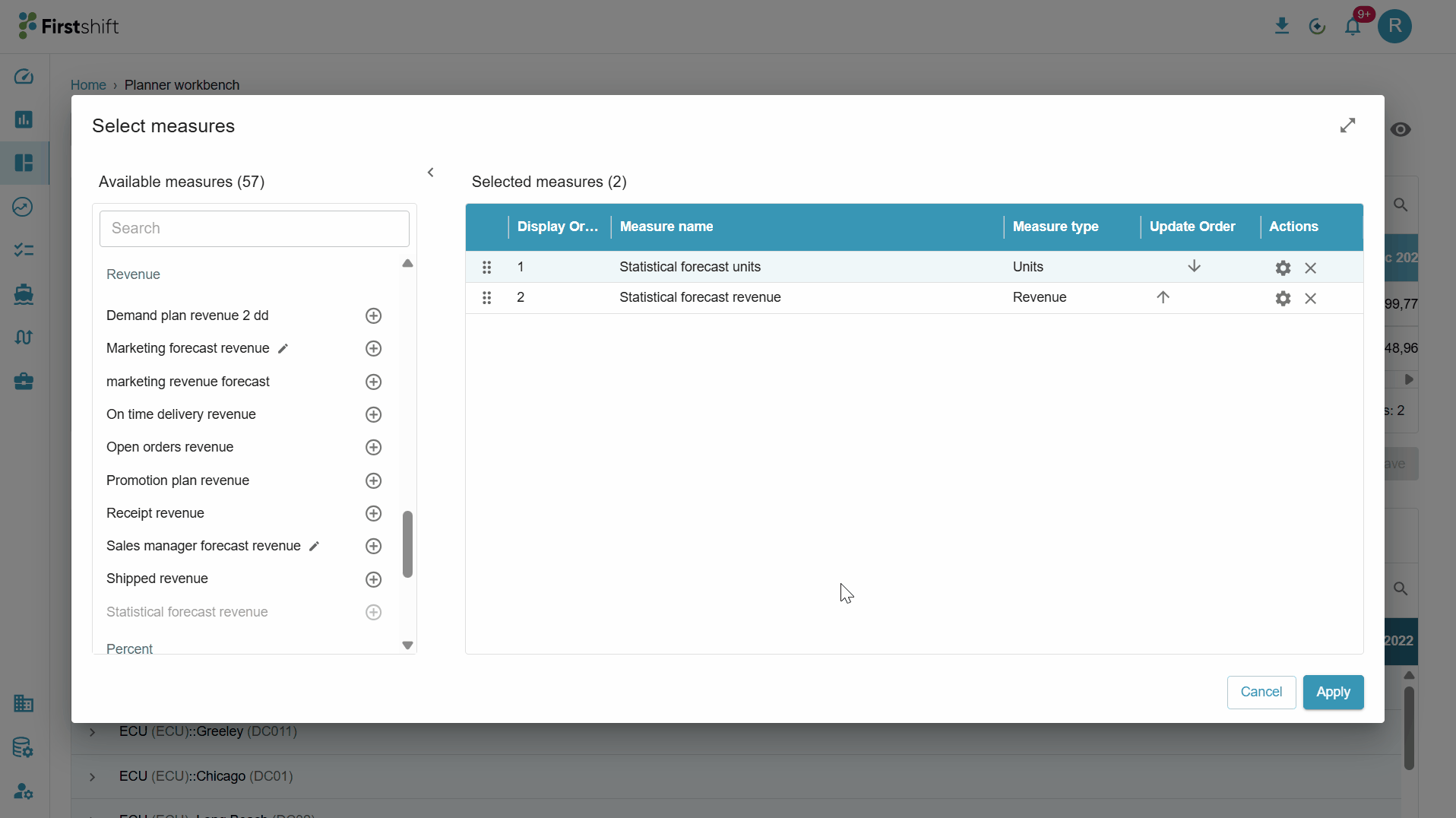
Remove: To remove a measure, click the Remove icon for that measure in the Selected Measures table. The measure is immediately removed and added back to the Available Measures list, allowing it to be reselected if needed.
Apply: After completing your measure selection and ordering, click Apply. The application refreshes and displays the data in the graph, summary table, and details table based on the selected measures, enabling you to analyze the planning data effectively.
Modify measures: You can add or remove measures at any time, even after applying your selections, by clicking the Measures button.
.

Time horizon: By default, the application displays historical, current, and future time buckets in the graph, summary table, and details table. You can change the time range by clicking the Time Horizon button, which opens a dropdown menu of available time ranges. Select the required time range and click Apply to update the view. You can also select a custom time range to define a specific start and end period. Once applied, the application refreshes the page and displays data in the graph, summary table, and details table based on the selected time horizon.

Planning item dropdown
Planning item: By default, the Planner View opens in the single-item view. All selected planning items are listed in the Planning Item dropdown. The first item on the list is displayed by default on the results screen. You can switch to a different planning item at any time by selecting it from the Planning Item dropdown, and the results update accordingly.
The Planning Item dropdown displays the list of items available at the selected hierarchy level, such as Family: All: All: All.
By default, the planner view displays the results for the first available item in the list. For example, if the family filter “Accessories” is the first item in the results table, the planner view displays results for that family.
Drilling down in the Planning Item dropdown
The drilldown hierarchies you selected when creating the bookmark also drive the Planning Item dropdown in the single-item view. Based on the selected drilldown hierarchies, the application displays drilldown options for the Planning Item dropdown, allowing you to expand a planning item and view its lower-level details — one level at a time — down to the lowest predefined level configured for the tenant.
What the dropdown shows
When you click the Planning Item selector, a dropdown opens to select a planning item.
The dropdown displays items based on the hierarchy level at which the bookmark is created. For example, if the view is created at the Family level, the top-level entries are Family items.
You can select only one planning item at a time.
Expand and drill-down behavior
Expanding a planning item reveals the next lower hierarchy level, taken from the drilldown levels selected for the bookmark.
The application drills down by only one hierarchy level at a time, and each level always comes from the predefined drilldown levels.
The behavior adapts dynamically to the hierarchy level at which the view was created and to the selected drilldown levels.
Example: Suppose the bookmark has these drilldown levels configured —
Product,
Product–Customer,
Product–Customer–Location and
The view is created at the Family level:
Expanding a Family item shows Product items.
Expanding a Product item shows Product–Customer items.
Expanding a Product–Customer item shows Product–Customer–Location items — the lowest predefined level in this example.
Similarly, if the view is created at Product–All–All–All, the first drilldown level is Product–Region, then Product–Customer, then Product–Customer–Location, and so on, based on the predefined hierarchy configuration.

Toggle visibility
The Planner Workbench provides visibility toggle controls that let you customize how data is displayed in the workspace. Using the visibility panel, you can dynamically show or hide specific sections such as charts, summaries, and detailed data without modifying the underlying configuration.
Visibility Options
Within the Show Panel, you can control the following sections:
Chart View
Toggle to show or hide charts
When enabled: Displays a graphical representation of selected measures
When disabled: Charts are hidden to allow more space for tabular data
Summary View
Toggle to show or hide the summary section
The summary typically displays: Aggregated or high-level data across selected dimensions
Useful for quick insights and comparisons
Detail View
Toggle to show or hide detailed data rows
When enabled: Displays granular, item-level, or lower hierarchy data
When disabled: Focus remains on summarized or higher-level data
Display Labels Configuration
The visibility panel also includes an option to control how labels are displayed. By default, the selected display label option is both.
Display Labels As: You can choose how dimension members (e.g., products, locations) are shown:
ID: Displays ID of the selected item, e.g., P123.
Description: Displays business-friendly names, e.g., Tablet device.
Both: Displays both ID and Description together, e.g., P123 - Tablet device

Was this article helpful?
That’s Great!
Thank you for your feedback
Sorry! We couldn't be helpful
Thank you for your feedback
Feedback sent
We appreciate your effort and will try to fix the article